Dark Mode and anti-light modes are transforming UI-UX design, creating user-friendly interfaces with reduced eye strain and improved accessibility. This article will help you learn the best practices for designing interfaces that align with these preferences. From color selection to user adaptability, let’s explore essential guidelines for integrating these modes effectively.
What Are Dark and Anti-Light Modes?
Understanding the Basics
Dark mode involves displaying light-colored text and elements on a dark background. It’s particularly popular for its ability to reduce eye strain, save energy on OLED screens, and improve aesthetics. Anti-light modes, on the other hand, go beyond dark mode by reducing overall screen brightness while maintaining a balanced contrast, catering to users sensitive to intense light.
A study by Android Authority reveals that 82.7% of smartphone users prefer dark mode for its comfort and visual appeal. This growing demand emphasizes the need for designers to incorporate these modes into their UI-UX design strategies effectively.
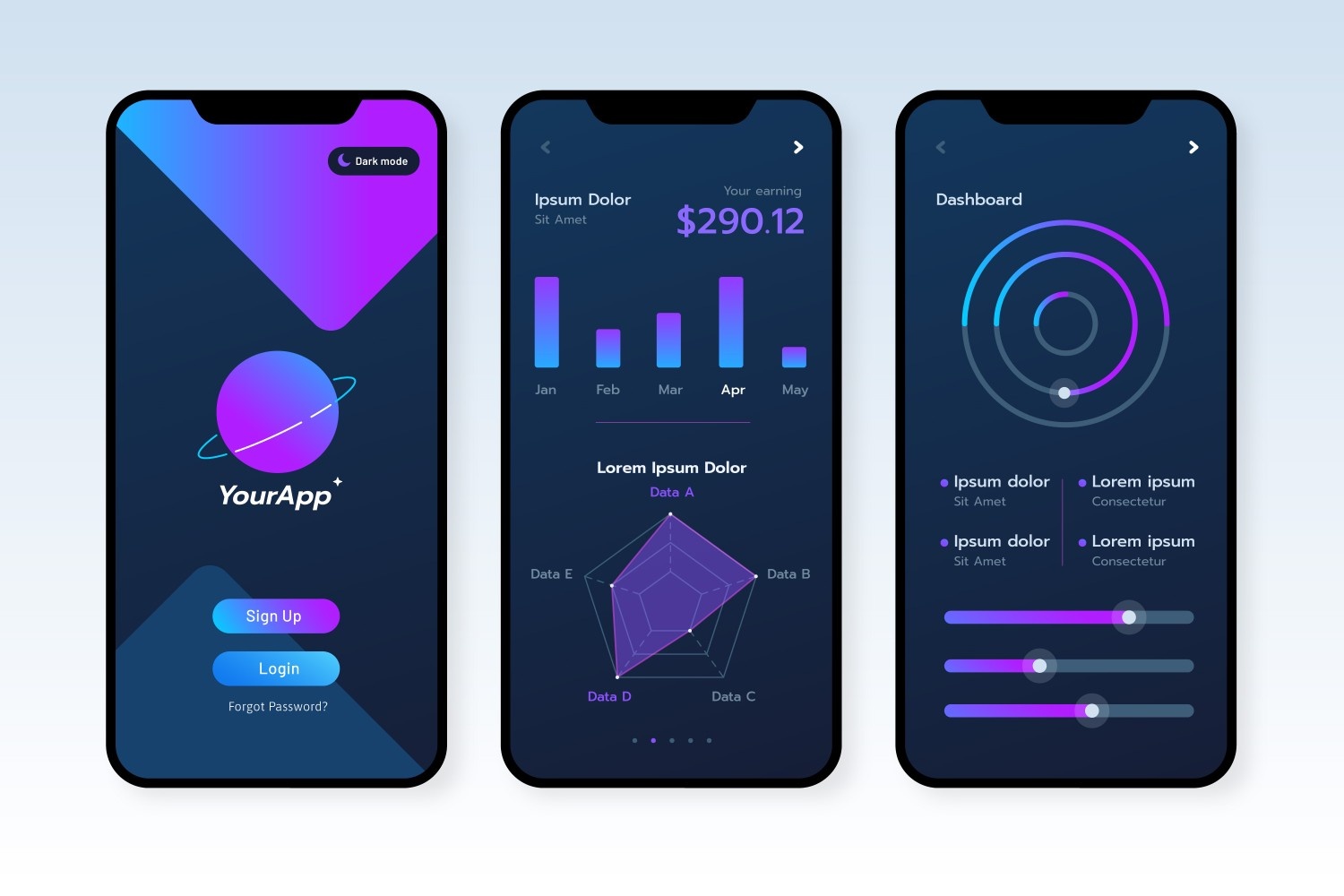
Image source - freepik.com
Why Are Dark and Anti-Light Modes Important?
Enhancing User Experience
- Reduced Eye Strain: Users who spend long hours on devices benefit from dimmer and visually comfortable screens.
- Energy Efficiency: OLED screens consume less power when displaying dark colors, extending battery life.
- Aesthetic Appeal: Dark interfaces often feel sleek and modern, resonating with tech-savvy users.
- Accessibility: These modes cater to users with light sensitivity or vision impairments, enhancing inclusivity.
Best Practices for Designing Dark and Anti-Light Modes
1. Maintain Contrast Balance
Poor contrast can make content hard to read in dark mode. Ensure a strong differentiation between foreground text and the background. For example, use light gray text instead of pure white to avoid glare.
Pro Tips:
- Contrast ratios should meet WCAG standards for accessibility (at least 4.5:1 for text).
- Use tools like Contrast Checker to validate your designs.
2. Choose Colors Wisely
Designing for dark mode demands a subtle and limited color palette. Bright colors often appear too harsh against dark backgrounds.
Tips for Color Use:
- Avoid pure black; opt for dark gray for better legibility.
- Choose muted versions of bright colors for highlights or accents.
3. Test Across Devices and Environments
User preferences vary across devices. Test your UI-UX design on smartphones, tablets, and desktops. Consider environmental factors like low light or bright outdoor conditions.
Real-life example: Spotify's dark mode has been optimized for seamless user experience across all platforms, setting an industry standard.
Typography Considerations in Dark and Anti-Light Modes
Readable typography is essential in dark interfaces. Use clear, sans-serif fonts to enhance readability. Increase line height and letter spacing to improve visual clarity.
What to Avoid:
- Thin fonts that become unreadable on dark backgrounds.
- Small font sizes that strain the eyes.
Additional Tip: Test fonts on both light and dark modes to maintain consistency.
Incorporating Dark Mode in Your UI-UX Design Process
Step 1: Begin with User Preferences
Always give users the ability to toggle between light and dark modes. A simple switch in the settings ensures greater user satisfaction.
Step 2: Design with Adaptive Themes
Adaptive themes allow dynamic adjustments based on the user’s system preferences or time of day.
Benefits:
- Improves usability without manual toggling.
- Provides a seamless user experience.
Common Mistakes to Avoid
1. Ignoring Accessibility Guidelines
Ignoring contrast and readability can alienate users with visual impairments.
2. Overusing Dark Colors
Monotony in dark themes can reduce visual interest. Incorporate subtle color gradients to add depth.
3. Forgetting Motion Effects
Dark and anti-light modes benefit from smooth animations to transition between themes. Sudden changes can disrupt the user experience.
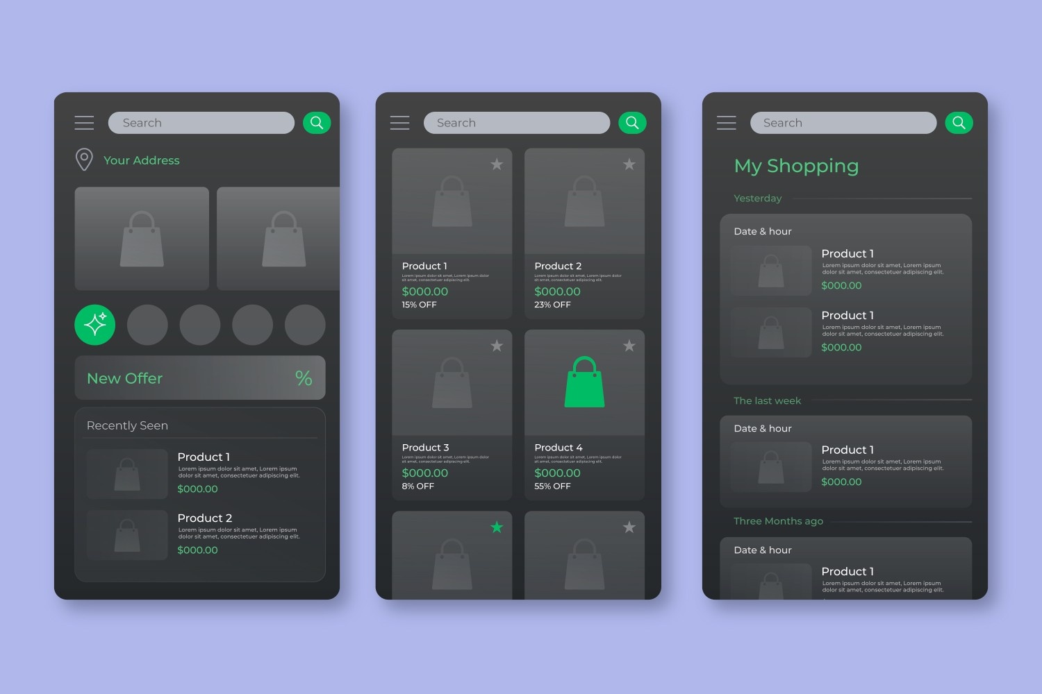
Image source - freepik.com
Advanced Techniques: Designing for Anti-Light Modes
Anti-light modes go beyond aesthetics to support visual health. Here are some advanced practices:
- Reduced Brightness: Limit the brightness of UI elements for nighttime use.
- Color Temperature Adjustment: Warm tones reduce blue light exposure, easing eye fatigue.
- Customizable Settings: Let users personalize contrast and brightness levels.
For example, Apple’s Night Shift feature adjusts screen brightness and tone to suit nighttime usage, blending convenience with user health.
How to Learn Advanced UI-UX Design?
A well-structured UI-UX design course can help you master these techniques. Whether you’re a beginner or a professional, a UX design certification ensures you stay updated with industry standards.
Key Takeaways from Courses:
- Understanding user psychology and preferences.
- Learning to design for dark and light modes.
- Testing interfaces for accessibility and responsiveness.
Conclusion
Designing with dark mode and anti-light modes is essential for modern UI-UX design. These modes enhance user comfort, energy efficiency, and accessibility. By following best practices like maintaining contrast balance, choosing adaptive themes, and testing for accessibility, designers can create visually appealing and functional interfaces. Whether you’re an aspiring designer or a professional, learning these skills through a UI-UX design course or a UX design certification is a step toward mastering modern design principles.
Take your skills to the next level with our advanced UI-UX Design Certification Course. Learn modern techniques and start creating user-friendly interfaces today!
Visit the Kaarwan website for more insights!
FAQs
1. Which design principle is emphasized when designing for dark mode?
The key principle is contrast balance, ensuring readability by maintaining a proper ratio between foreground and background elements. This enhances clarity and accessibility.
2. What considerations should we make with a dark background color?
Avoid using pure black; opt for dark gray to reduce glare. Ensure text and UI elements have sufficient contrast and avoid overly saturated or bright colors.
3. What are the pros and cons of dark mode?
Pros: Reduces eye strain, saves battery on OLED screens, and looks modern.Cons: Can cause readability issues in bright environments and for some users with vision impairments.
4. What is the best color scheme for dark mode?
Use dark gray for backgrounds, light gray or off-white for text, and muted colors for accents. Avoid pure black and overly bright hues to maintain comfort.
5. Is dark mode safer for eyes?
Yes, it reduces glare and eye strain in low-light conditions. However, it’s not universally better; prolonged use in well-lit environments may still cause discomfort.